Tough competition on the ecommerce market makes retailers continuously search for new ideas to improve web stores’ UX. Optimizing the product page is one of the key areas in this quest for enhancements.
We reviewed the best practices of ecommerce leaders and success stories of smaller merchants, and came up with three hacks that make any product page convert more visitors into customers.
1. Optimize product descriptions
A good product description is a top factor influencing customers’ desire to purchase. The problem is customers want to get answers to their questions, but they don’t want to read a lot. Average web-surfers give a web page no more than 15 seconds to capture their attention. If a product description fails to meet this deadline, it fails to convert.
Customers think about different aspects of a product: Some are interested in materials, some are more concerned about durability. To make a product page convert well, you have to strike a balance between being informative and brief. Here are the best practices in product description derived from the success of market leaders:
- Start with a unique value proposition: A brief product description that welcomes a potential shopper must clearly explain what is so special about this item. A selling product page doesn’t speak about features, it shows what particular benefits customers get when they buy the item.
- Avoid visual overload: Structure key information using headers and collapsible sections to save space on the page. This makes product pages more transparent and interactive, as well as minimizes the time required to get the key ideas.
The screenshot below shows how Oliver implements these principles on their product pages. They hide the detailed information about product features, materials and delivery options in expandable sections.

Mulberry went a step further and combined tabs for Description, Details, Material, and Size Charts with pop-ups for Delivery and Returns. The result? All types of customers get excessive information about the product without reloads and scrolling.

The case of The Sims 3 manufacturers also proved that clarity and order drive conversion. They tested six versions of the “game launcher,” all of which had particular benefits, simpler design, and lesser information. As a result, conversion increased up to 128%.
2. Give people more images to describe items
Human beings are very good at processing visual information, much better than at reading. This means pictures and colors on product pages create the first impression of items and thus are even more important than descriptions.
- Size matters: A product image is the only way for a customer to feel the product. So make sure that shoppers can zoom in to examine the product in detail (its fabric and tiny parts). These are not just words. Larger images helped Skinner Auctions by 63%. Skinner Auctions scaled their catalog images from 250 pixels to 350 pixels. And what’s even better? The amount of bidding visitors who actually filled out all the online forms required to place a bid rose to a huge 329%.
- Angles matter as well: Surprisingly, it is a common mistake to show the product only facing forward. Customers want to see the interior pockets of a purse, the back of a dress, and the outsole of a shoe. A well-selling page features the product from different angles or even provides a video showing how it looks in motion. Look at ASOS, they allow you both to inspect the skirt’s texture and buttons and to watch a short video clip.

- Customers want to try on items: Online shoppers are concerned about how items will suit real them rather than professional models. Many successful web stores show their products on people with different body shapes. This helps customers imagine themselves with items and make purchase decisions easier and faster.
- We believe people more than models: Amazon and ModCloth ask their customers to share personal photos in the product reviews. Such a gallery is included in the product description to show customers how items look in everyday life and make the product page more trustworthy.

3. Dialog with customers
Do online retailers have fewer opportunities to talk to their customers than brick-and-mortar do? Not really. Though communication between web stores and shoppers doesn’t happen face to face, merchants can still say everything customers want to hear and ask for everything they need to know.
Add an FAQ and tips to the description to clarify any doubts. An FAQ has several benefits as it:
- Answers the questions of the customers that are already on the page.
- Attracts new visitors to product pages from the browser’s search results.
- Helps keep product descriptions short.
Apart from a full-fledged FAQ, you can try short tips as RollerSkateNation.com did. Their sincere advice was not oriented on increasing sales directly. In fact, it showed customers how to replace roller states for kids less frequently by buying larger items and wearing double socks. Customers felt taken care of and increased purchases by 69%.
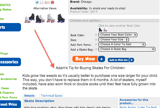
The position of the tips and the FAQ section is also important. In the above case study, RollerSkateNation managed to further boost revenue by 99% by placing their hint below the product description. Customers had enough time to process key details and then got really useful advice as a surprise.
Use reviews to build trust. When it comes to making a purchase decision, reviews are almost as important as product descriptions and prices. Most shoppers look for reviews and, at best, they can read credible feedback right on the product page. This way customers don’t have to leave the web store and are less likely to choose another vendor. The case study of Express Watches proves that a well-designed Reviews section can increase conversion by 59%.What does this “well-designed” mean? The product page should let shoppers sort and rate reviews, add images and stars. To show even more credibility, you can pick some reviews and put them forward as testimonials.
And for sure be careful with negative reviews. Try to express your professionalism and care. In fact, a well-processed negative review can be even more convincing than a dozen positive ones.
Ask customers how to improve conversion. Small details, like words and button colors, influence the success of product pages. Though A/B tests make attempts to polish the web store less risky, don’t be shy to ask customers directly about their impression. For example, Amazon introduced a new feedback feature that shows how shoppers rate the size of the item.

By the way, this is a great CX feature per se that allows customers to quickly understand which size to take without exploring the size guide. But now pay extra attention to their poll about the utility of the feature. Why not ask customers if you can do it?
What’s next?
However good best practices are, they work well nine times out of ten. Unfortunately, there is no guarantee that your case isn’t the tenth one. Trust seals normally improve conversion as they make the website look trustworthy. But Icouponblog managed to increase their conversion by 400% by removing a security badge. What does this mean for you? The theory is worth reading, but real results appear only after you test and try. Devote enough time to validate your ideas, and you will definitely find the way to a high-converting product page.
Maria Marinina is a Digital Marketing Manager at Iflexion.
The post Three ideas to create a high-converting product page appeared first on Search Engine Watch.
from Search Engine Watch http://bit.ly/2vino1F
Comments
Post a Comment